If I see one more SaaS landing page using default Inter or Roboto without any customisation, I might scream. Look, I get it. When you are building an MVP, typography often takes a backseat to functionality. But here is the reality: typography is the highest-leverage asset you have to make a bootstapped product look like a Series A contender.
At Precode, we ship production-ready UX in 5 days. We do not have time for six-month branding workshops or debating the philosophical merits of a lowercase 'g'. We need type that works, loads fast, and sets the tone immediately. While Google Fonts is an incredible resource, pairing a ubiquitous free font with a distinctive premium header font is the secret weapon of modern product design.
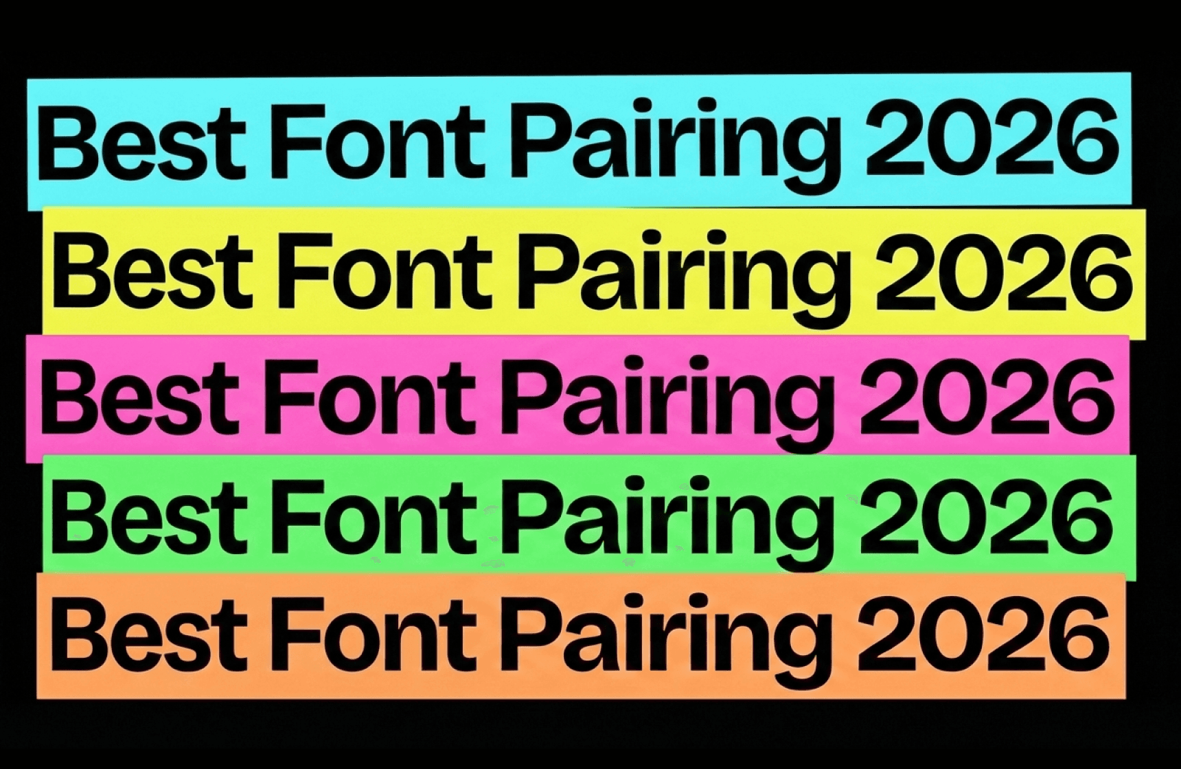
Here is our practitioner's guide to the best font pairings for 2026, mixing accessible workhorses with characterful heavy hitters from our favourite independent foundries.
SaaS products: clean utility with personality
For B2B SaaS, legibility is king, but you do not want to look sterile. You need a voice.
1. Untitled Sans (Klim Type) + IBM Plex Mono (Google)
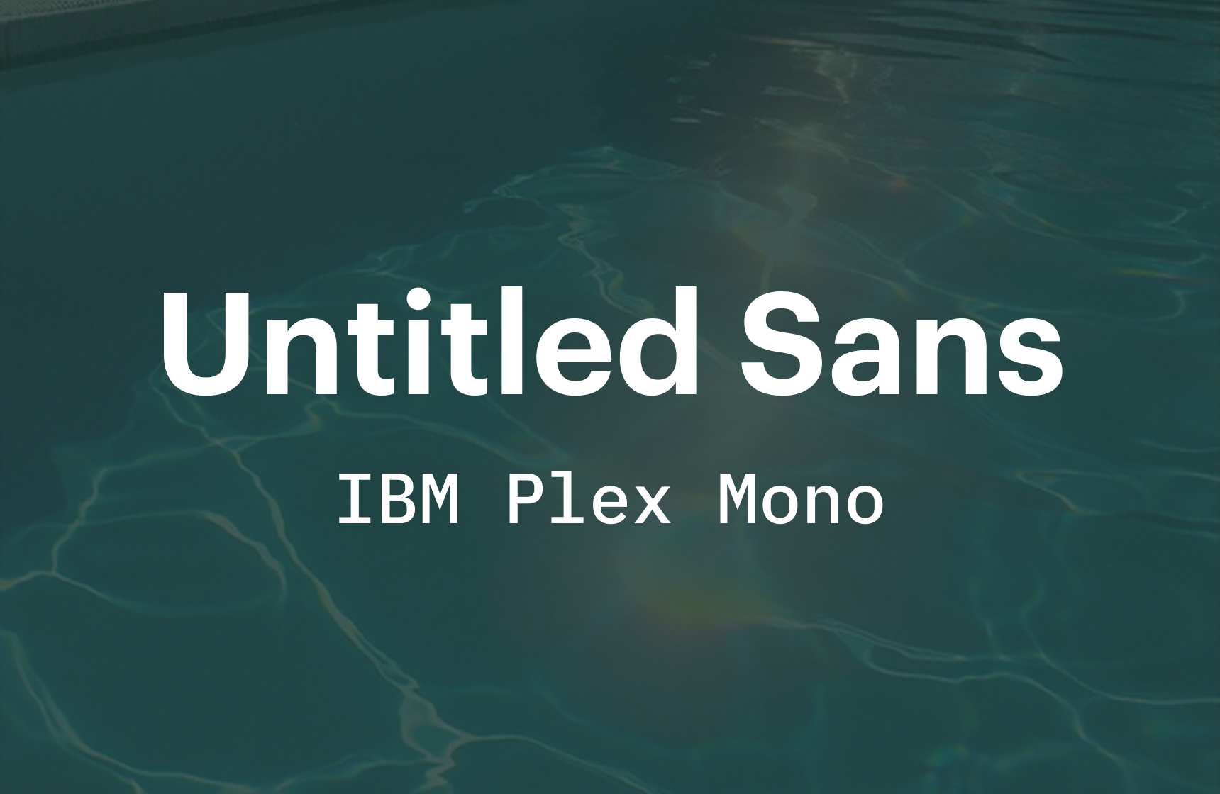
The Vibe: Brutalist efficiency. Untitled Sans is the ultimate 'anti-design' font that looks incredibly premium. Paired with the technical nature of IBM Plex, it screams 'developer tool'.
Cost: Klim licences are one-off fees (approx £300 for web). IBM Plex is free.
2. Aeonik (CoType) + Inter (Google)
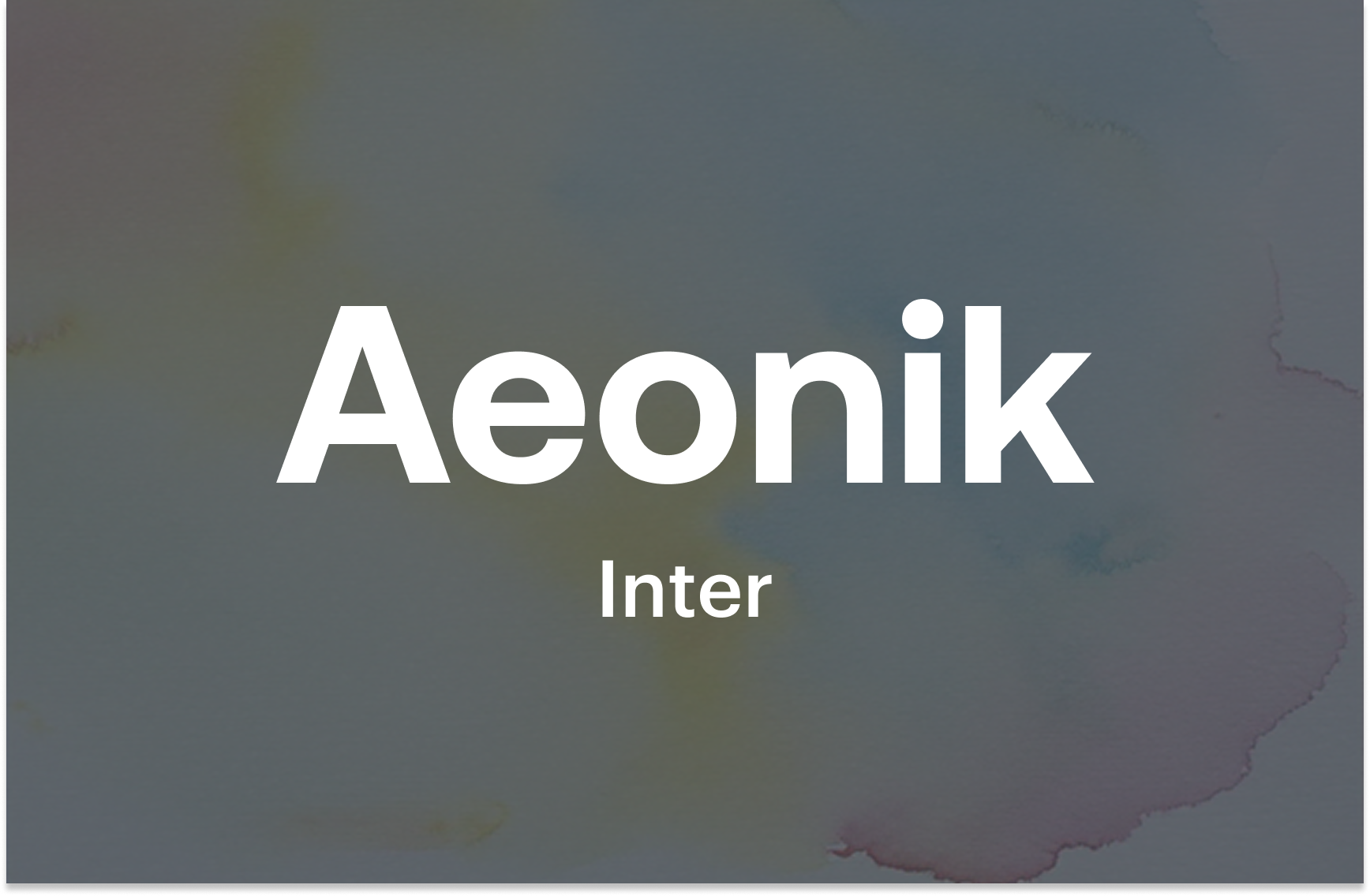
The Vibe: Modern tech standard. Aeonik is what Inter wants to be when it grows up—wider, confident, and structurally sound. Use Aeonik for headings to break the monotony of Inter body copy.
Cost: CoType offers tiered pricing, usually starting around £200.
3. Söhne (Klim Type) + Source Serif 4 (Google)
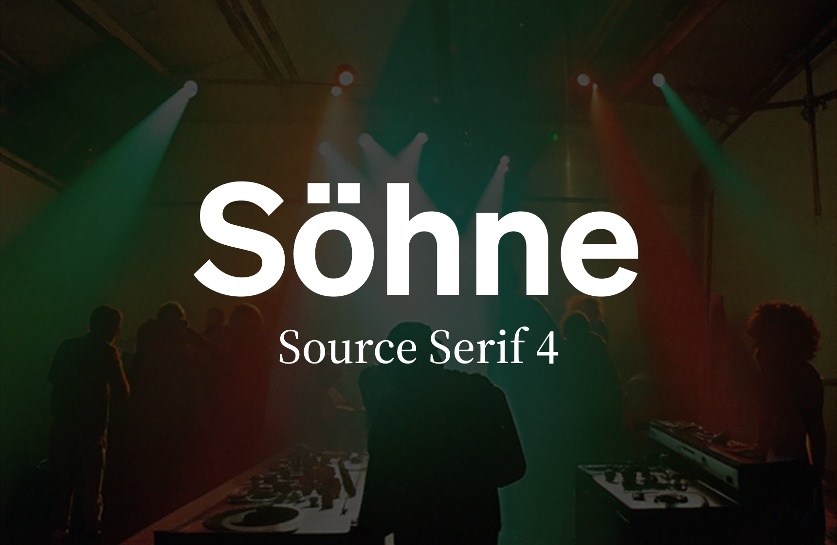
The Vibe: Editorial SaaS. If your product involves heavy reading or documentation (like Notion or Linear), this pairing brings warmth to digital spaces. Söhne captures that mid-century Akzidenz-Grotesk spirit perfectly.
Fintech apps: trust without the suit
Fintech in 2026 isn't about looking like a bank; it's about looking like a capable technology partner.
4. Mabry (Colophon) + Manrope (Google)
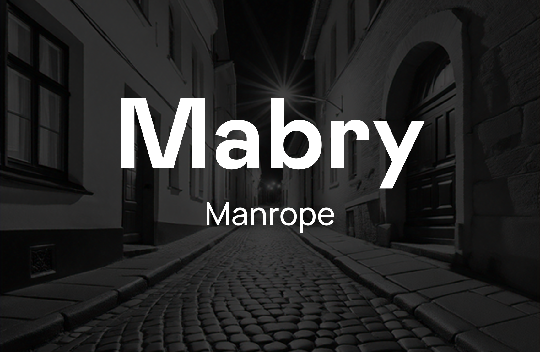
The Vibe: The friendly disruptor. Mabry has these odd, charming moments in its geometry that make a brand feel human. Manrope is a semi-geometric sans that supports numbers beautifully—essential for dashboards.
Cost: Colophon pricing is based on company size. Manrope is free.
5. Heldane (Klim Type) + DM Sans (Google)
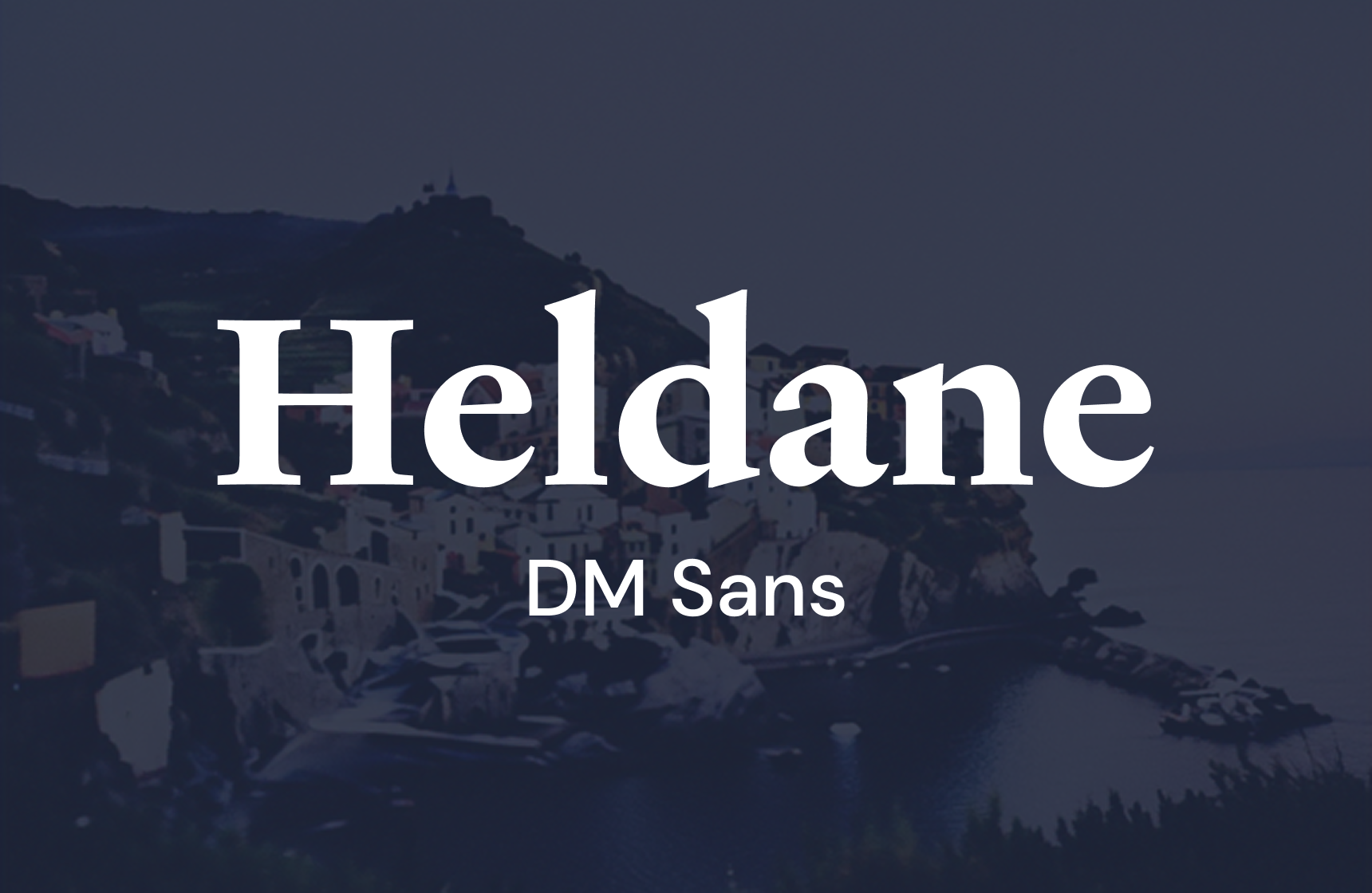
The Vibe: Premium wealth management. Heldane is a razor-sharp serif that commands respect. DM Sans keeps the UI elements clean and low-contrast.
6. GT America (Grilli Type) + Roboto Mono (Google)
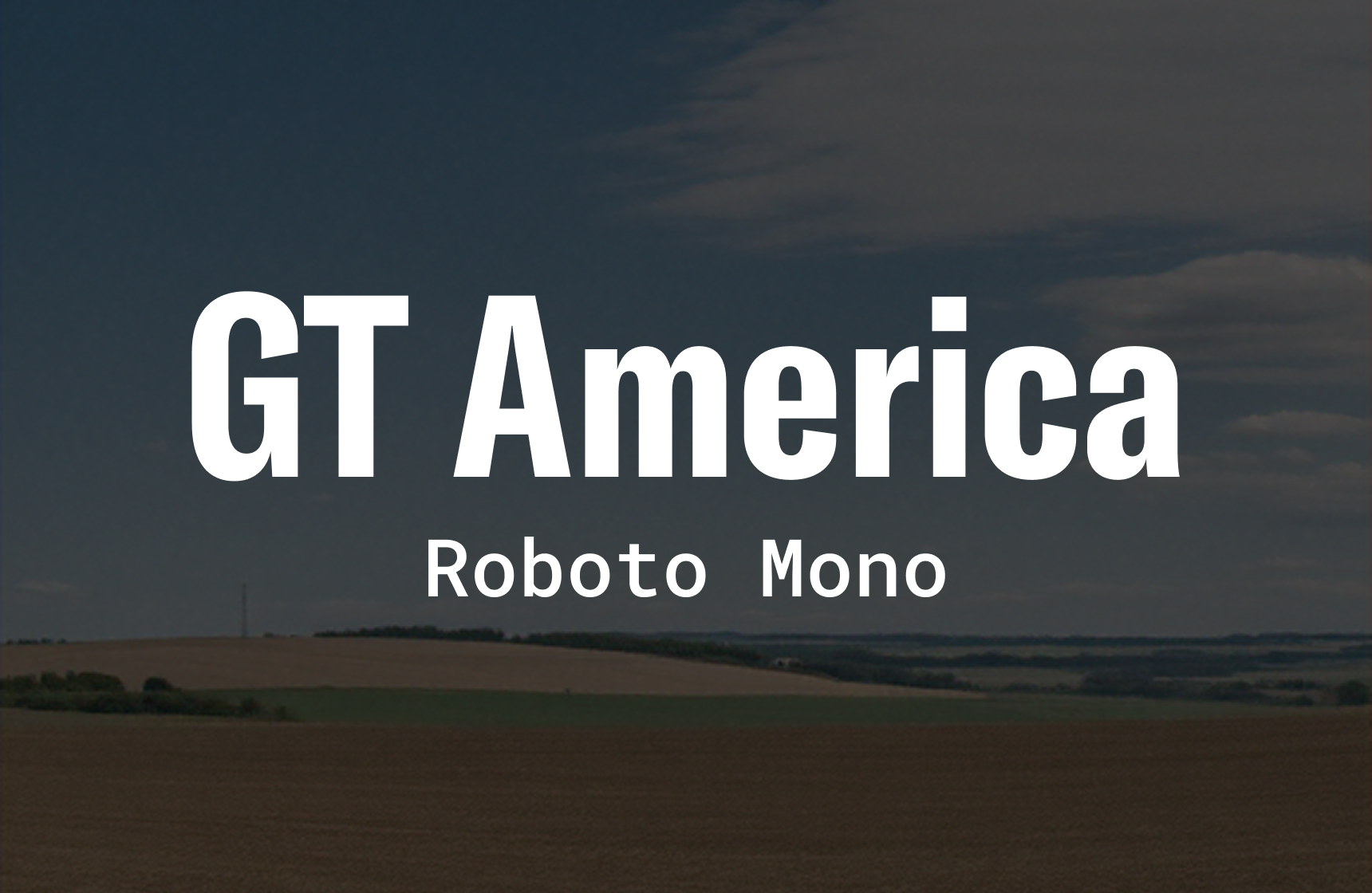
The Vibe: The data broker. GT America bridges the gap between American Gothic and European Grotesque. It is authoritative. Pairing it with a monospaced font implies precision and data integrity.
Creative portfolios: let the work breathe
When we design for agencies or creators, the type needs to frame the content, not overpower it.
7. Ogg (Sharp Type) + Mulish (Google)
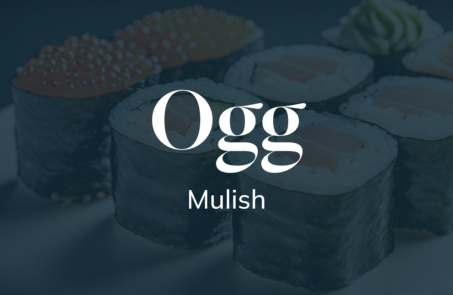
The Vibe: Calligraphic elegance. Ogg is everywhere for a reason—it is stunning. It adds an italicised flair that turns a simple headline into a logo. Mulish is invisible enough to let Ogg shine.
Cost: Sharp Type licences can be pricey but are worth every penny for the brand value.
8. Editorial New (Pangram Pangram) + Space Grotesk (Google)
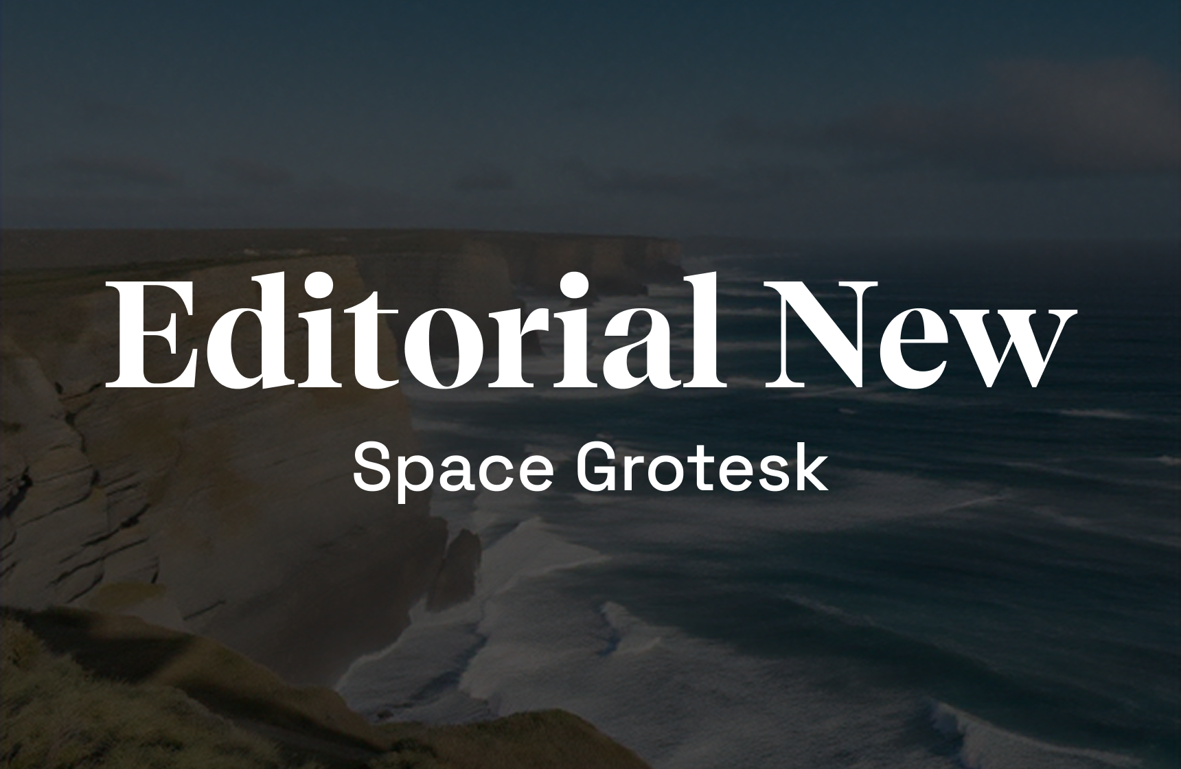
The Vibe: The 90s revival. Editorial New is a narrow serif that feels like a vintage magazine. Space Grotesk adds that quirky, brutalist tech edge. A favourite combination for Web3 and art direction portfolios.
Cost: Pangram Pangram has very accessible starter licensing.
9. GT Super (Grilli Type) + Karla (Google)
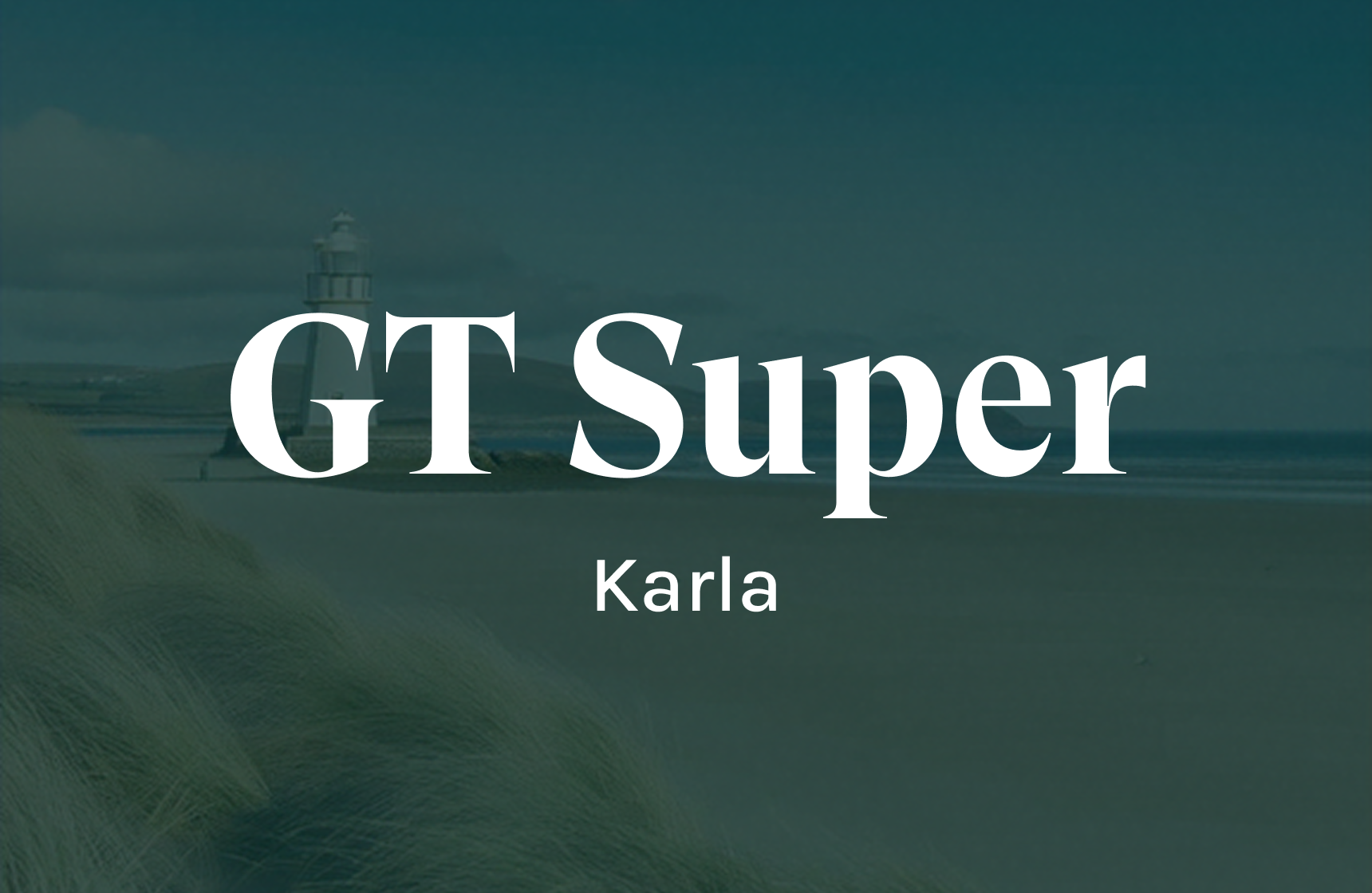
The Vibe: Narrative-driven. GT Super captures the motion of writing. Karla is quirky but extremely readable, making it a great partner for long-form case studies.
E-commerce: conversion-led typography
In our MVP Sprints for e-commerce clients, clarity equals conversion. If they can't read the price, they won't buy it.
10. Doyle (Sharp Type) + Lato (Google)
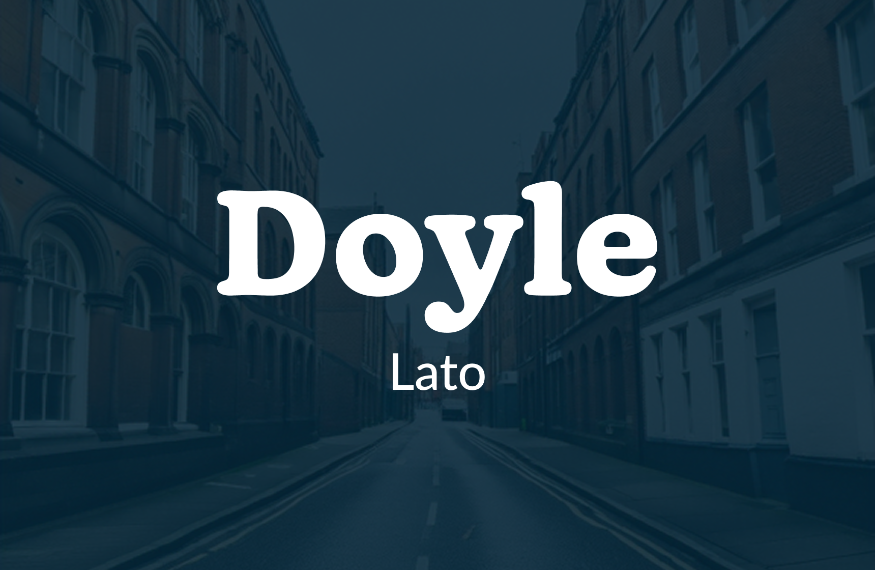
The Vibe: Friendly distinctiveness. Doyle is soft, round, and welcoming. It makes a brand feel approachable. Lato provides the stability needed for checkout flows.
11. Canela (Commercial Type) + DM Sans (Google)
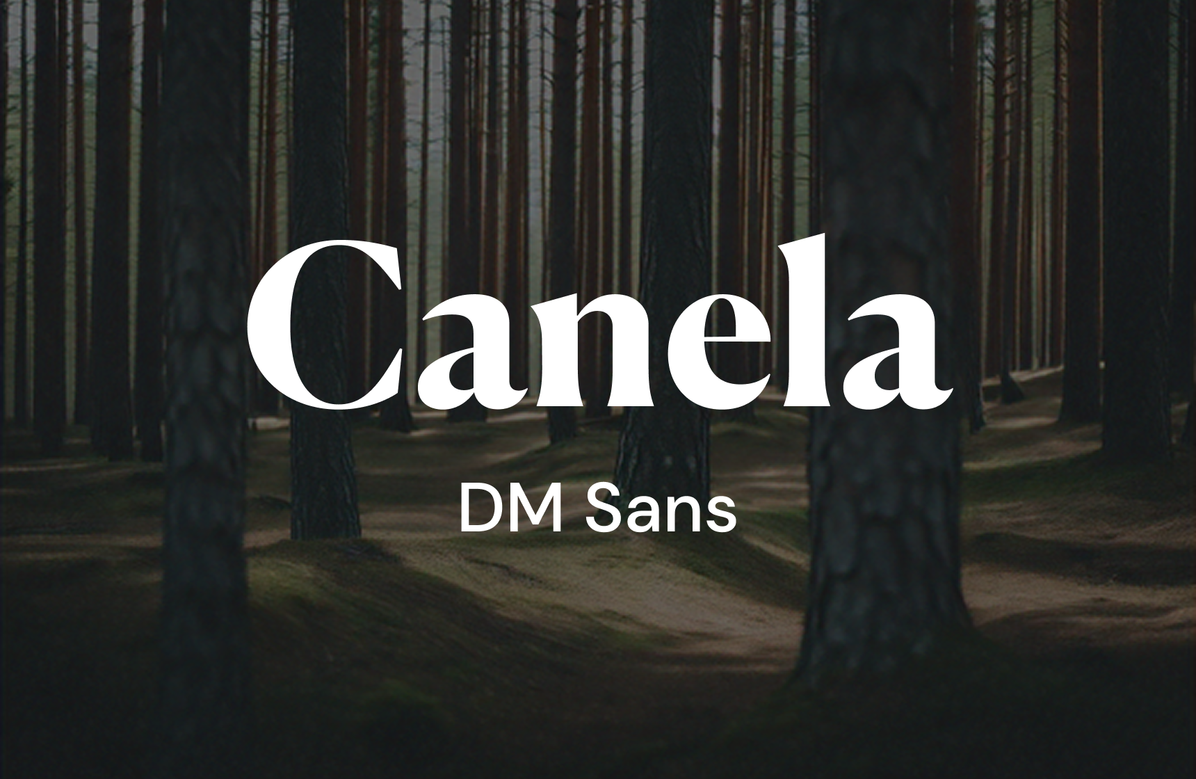
The Vibe: High-end luxury. Canela defies classification—it is neither sans nor serif. It is pure elegance. Perfect for beauty or fashion brands.
12. Recife (Velvetyne) + Work Sans (Google)
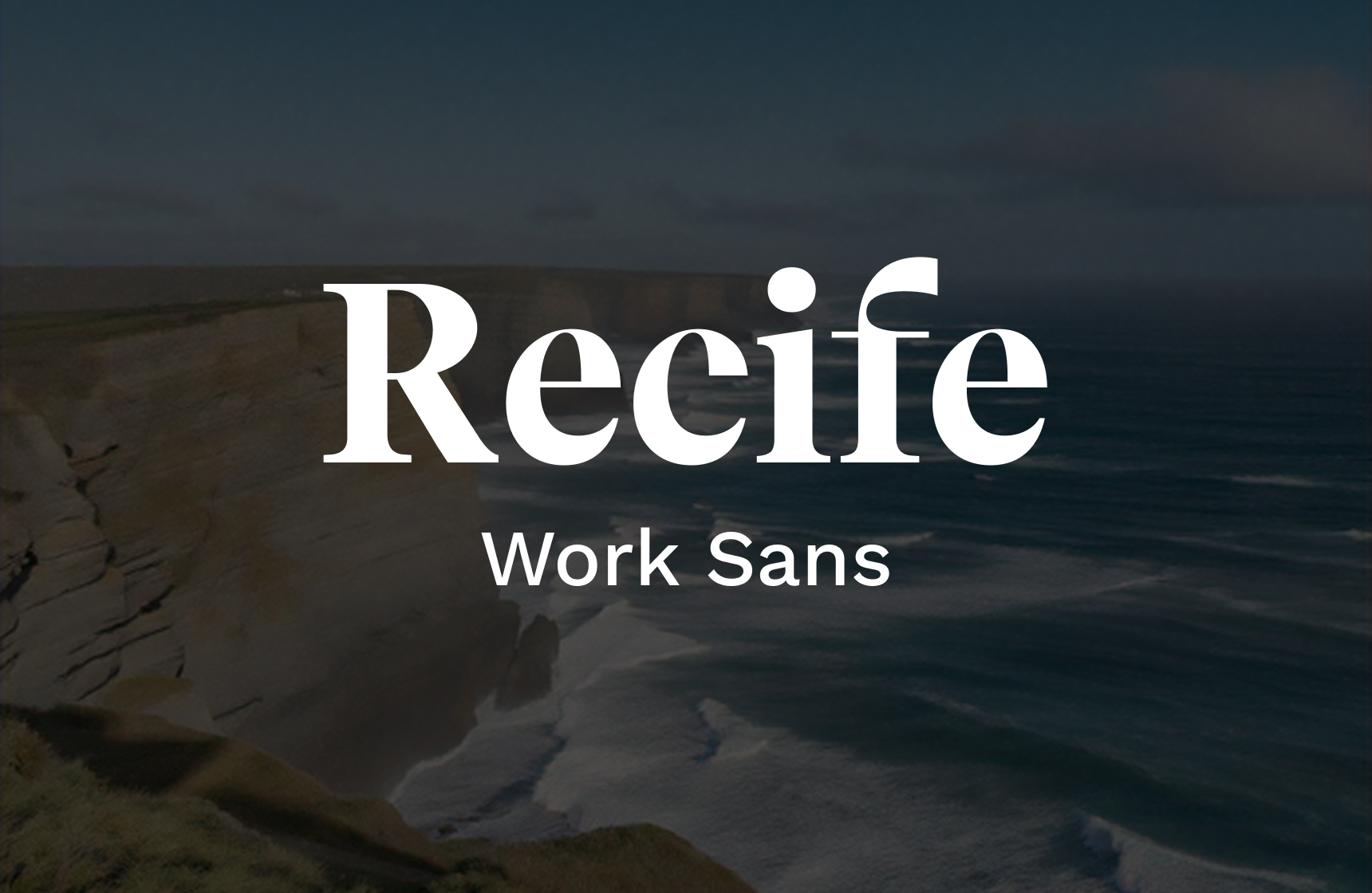
The Vibe: Budget-friendly bold. Recife is a hidden gem from Velvetyne (open source/free) that looks like it costs £500. It is a high-contrast serif that pairs perfectly with the utilitarian Work Sans.
Cost: Both are free. This is the best zero-budget pairing on this list.
Mobile apps: legibility on the go
Mobile screens are unforgiving. You need x-heights that work at 14px.
13. Neue Montreal (Pangram Pangram) + JetBrains Mono (Google)
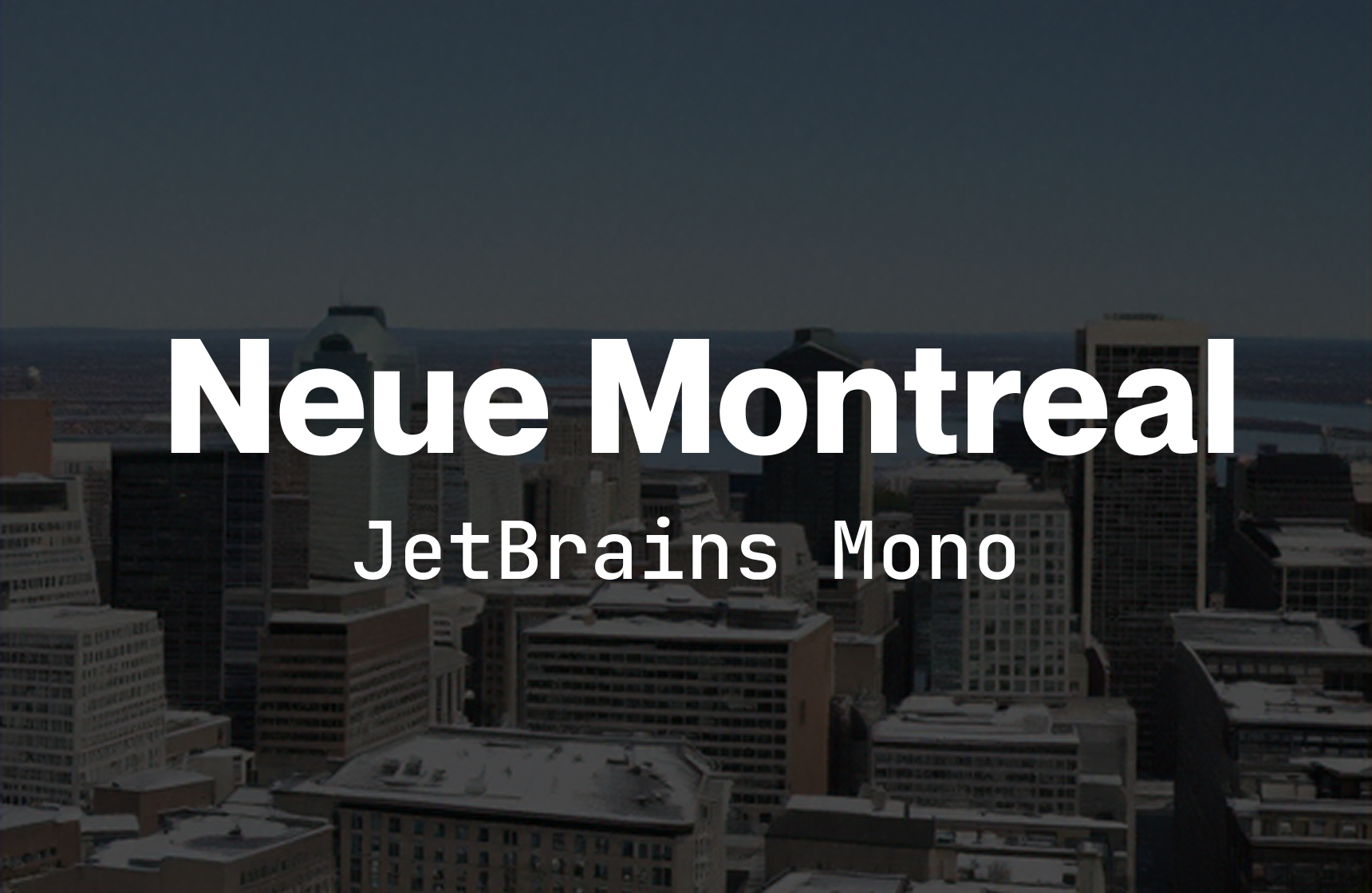
The Vibe: The utility app. Neue Montreal is incredibly versatile and tight. JetBrains Mono is, in my opinion, the best coding font that doubles as a UI font for technical data.
14. General Sans (Fontshare) + Satoshi (Fontshare)
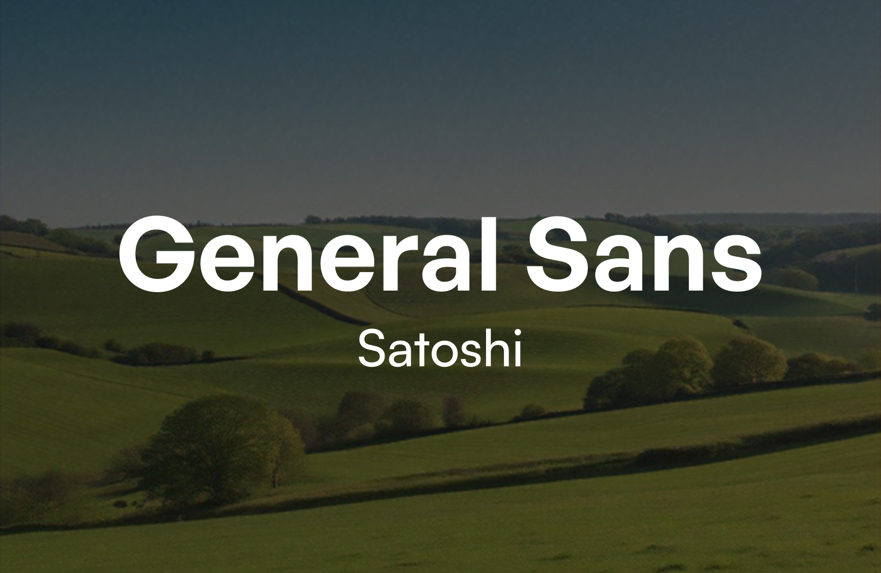
The Vibe: The modern startup. Okay, these aren't Google, but Fontshare (by Indian Type Foundry) offers them for free. General Sans is a robust alternative to Inter with more character.
15. Whyte (ABC Dinamo) + Plus Jakarta Sans (Google)
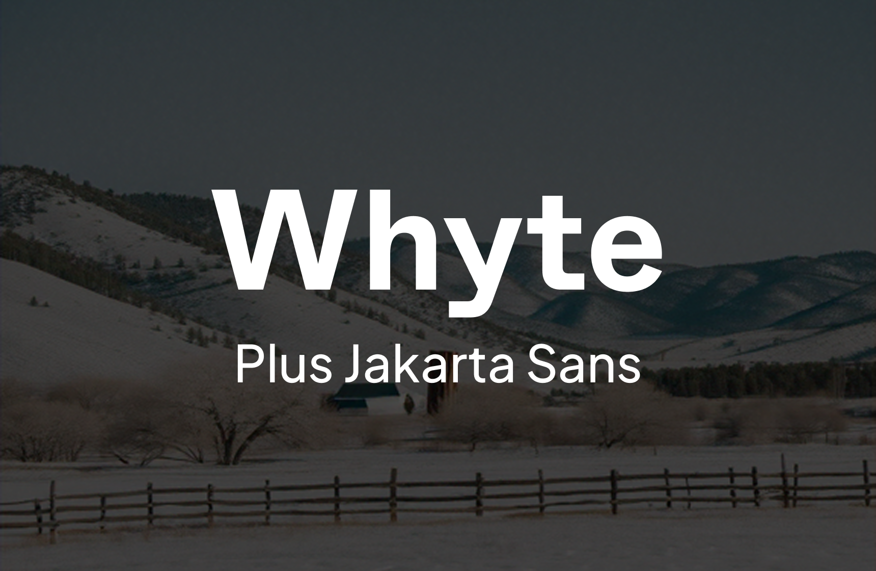
The Vibe: The geometric humanist. Whyte has deep ink traps that look great at large sizes. Plus Jakarta Sans is a modern geometric sans that renders beautifully on iOS and Android screens.
A note on licensing and speed
During a 5-Day UX Sprint, we don't have time to negotiate enterprise font licences. We usually recommend clients start with a solid Google Font pair or purchase a desktop licence for a hero font (like Ogg or Untitled) to validate the brand.
Remember, your users don't care about the font history. They care if they can read the content and if the product feels trustworthy. Pick a lane, pay the foundry (good type designers deserve to be paid), and ship the code.


